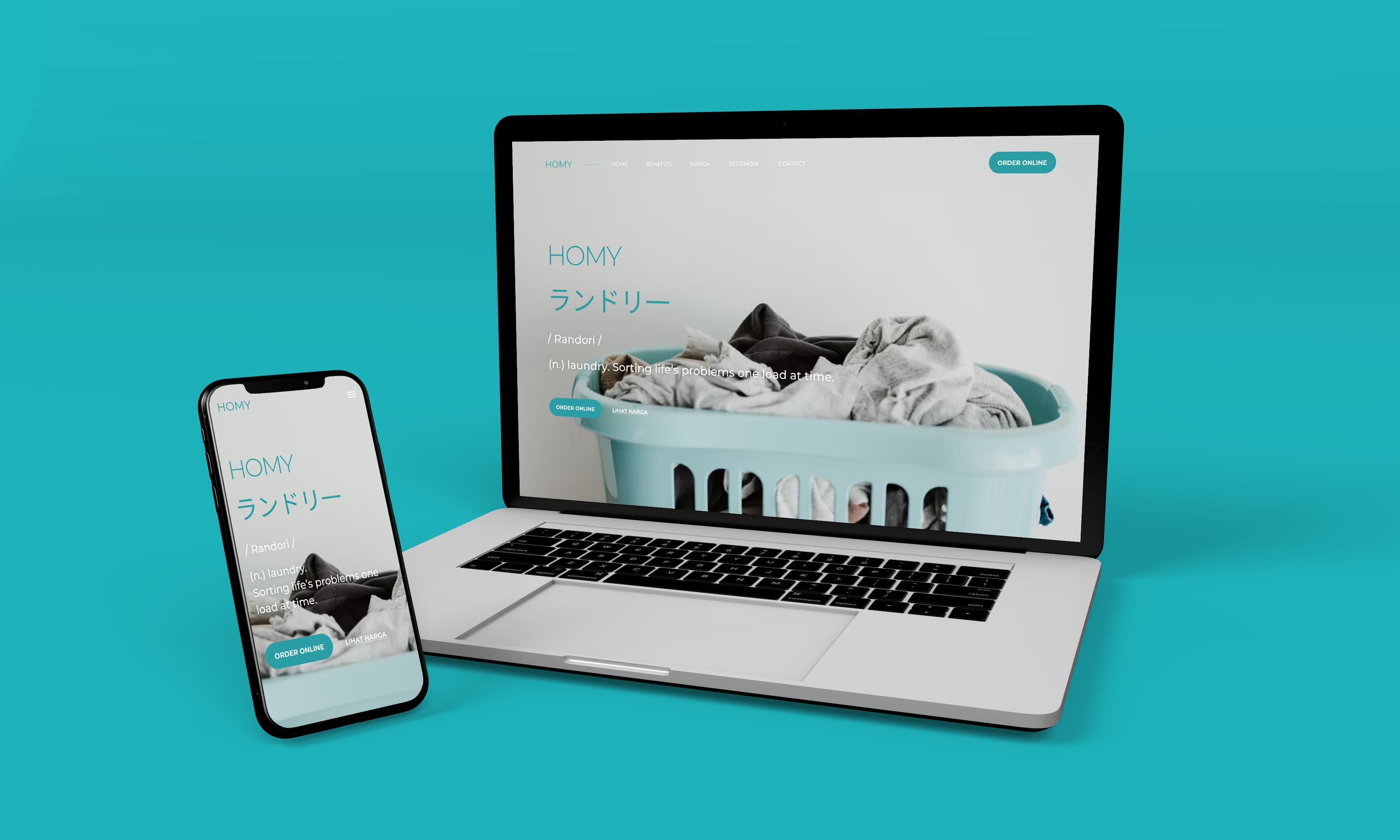
Homy Web Design
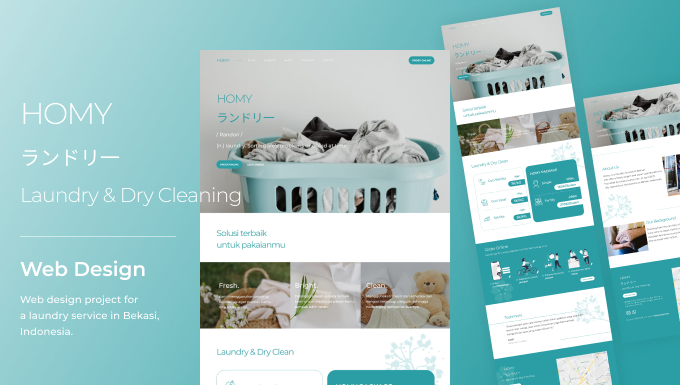
Client: HOMY
Year: 2022
Homy is a laundry service in Bekasi. They offer a fresh, bright and clean laundry service. In 2021 they opened their first service in Bekasi, Indonesia. The customers are mostly young people and workers who don't have time to clean their clothes and want their clothes to be cleaner.
Goals
This is what HOMY wanted to achieve on their first site.
-
Brand Awareness. Shows that HOMY is a professional and modern service, offering convenience for people who want their clothes to be clean without hassle.
-
Different Vibes. So that people see HOMY differently from laundry services in general. Having a website is proof that HOMY is a professional and modern service.
-
Fresh, Bright, Clean. On their first website, HOMY wanted to showcase something fresh, bright, and clean, just like their tagline.
The User & Audience
Its target audience is people who don't know HOMY, young people and workers who don't have time to clean their clothes.
Role & Responsibility
-
UI Designer. I gather requirements from HOMY to implement into designs, create wireframes, final mockups, and presentations to stakeholders in meetings.
-
Project Manager. I do this project myself, meaning I also work as a project manager communicating with the clients.
-
Frontend Developer. Well, I have basic frontend skills, like HTML, CSS and Javascript. So, at the same time, I am developing this site into a website that is pleasing to the eye, has good functionality and is accessible to all devices.
Scope
This is HOMY's first website, so I created this website from scratch. From the look, feel, elements and design of each page. These are the pages:
-
Homepage
-
Benefits
-
Services
-
Price
-
Online Order
-
Testimonials
-
About Us
-
Contact
Process
Gathering Requirement
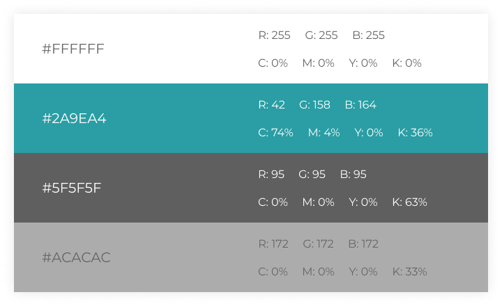
I asked the owner what the purpose of this site was, what they wanted to achieve, the look and feel they were looking for, and if there was a site to reference. So, they want a minimalist, fresh, clean look, using only the basic white color, and the colors from their brand.
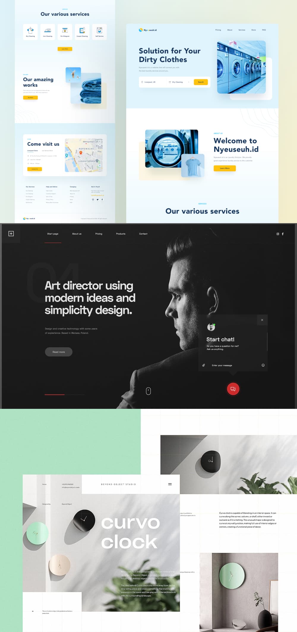
Website Inspiration
I looked up some references on Dribble for inspiration. And these are some references.
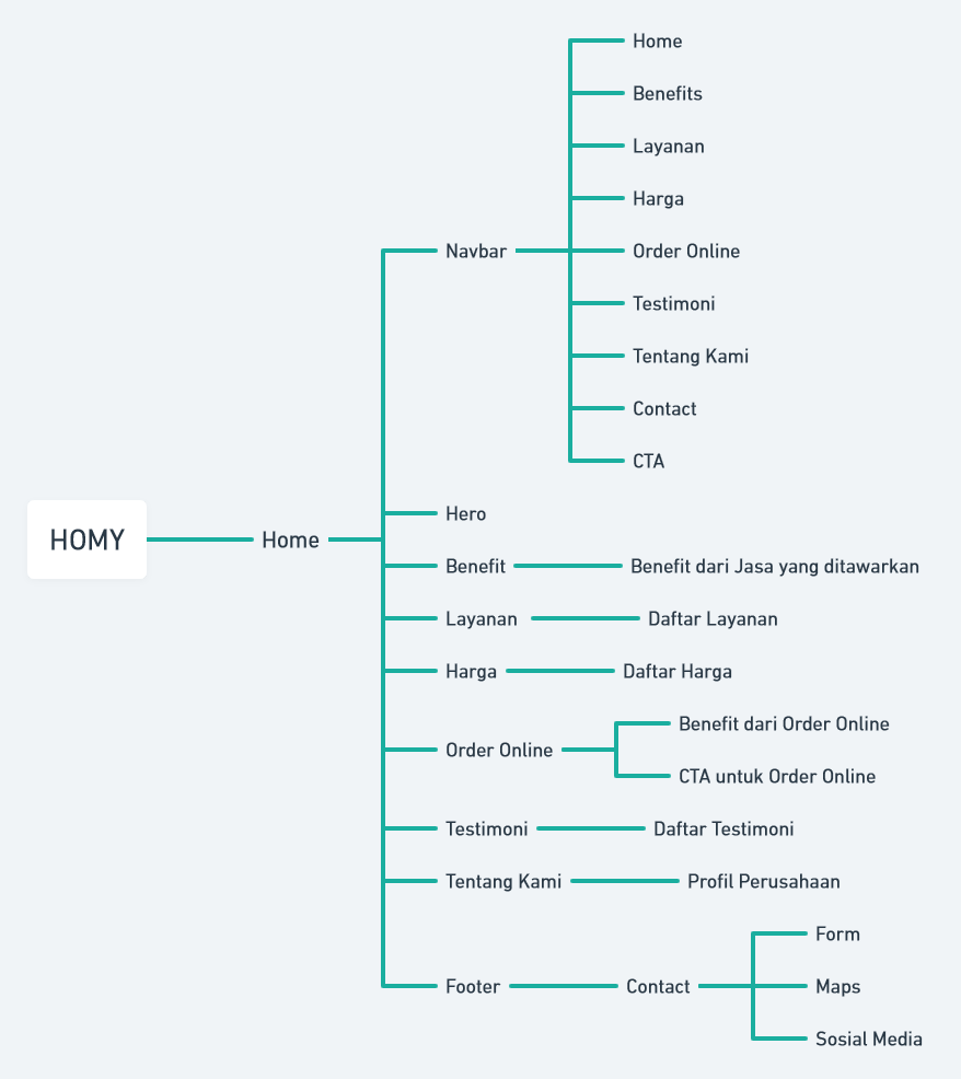
Sitemap
This is a very simple site, but it is very important to create a sitemap, so that it is easier for us to have an overview of the site.
Wireframe
The next step is to create a wireframe. I also do some copywriting. So, this makes it very easy for me to organize the layout and content of this site.

Struggle
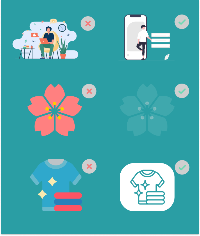
Creating a simple design is not that simple, I struggled a little when I needed elements like icons and illustrations. I wonder if this will detract from the simplistic feel of this design?
Defining Design Elements
After I read an article about using illustration on dwinawan.com, I decided to keep providing some illustrations in some sections, but I used simple elements and used a little color.
Mockup
Yeah, this is the most fun process, Mockup. After getting the Design Elements and the appropriate Color Palettes, I created a mockup. And this is a mockup of the site.

Design Decision
Hero Section
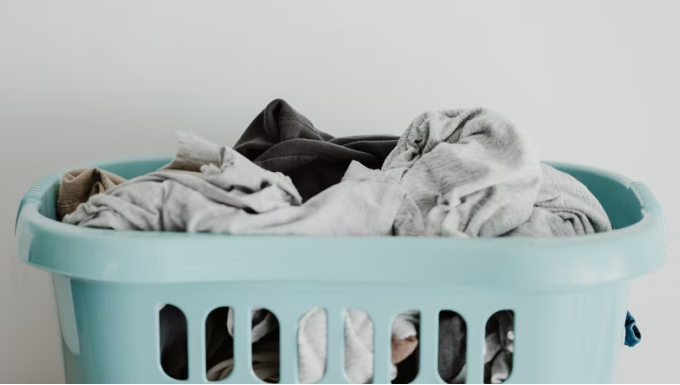
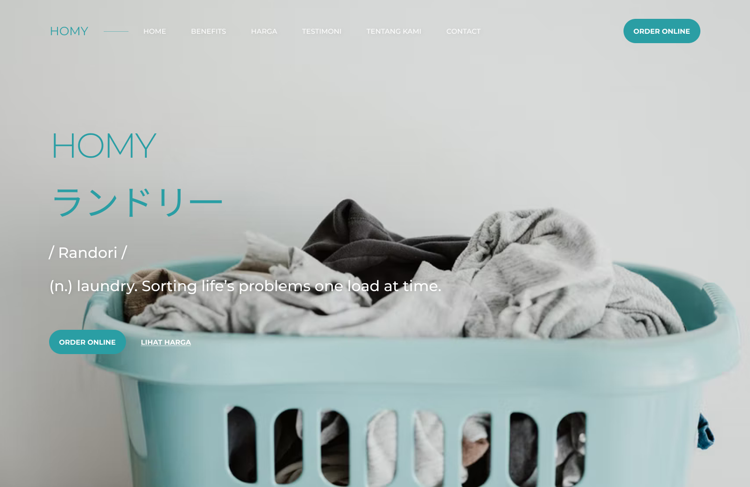
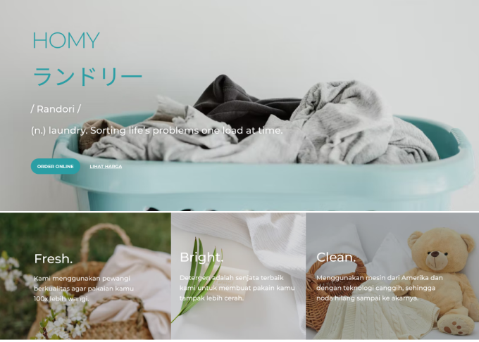
When a client asks for a minimalist design, then I just put the HOMY's logo and its Japanese tagline, then use a relevant background image, and I make the Navigation bar transparent, this makes it look clean and fresh.
Clean Typography
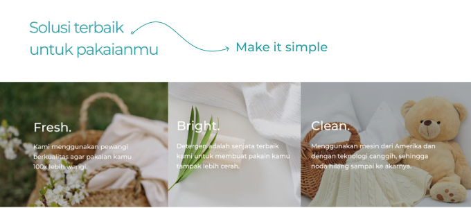
I didn't use Bold Font in the header for this design, because I think using Light Font will make this design look clean and simple. Of course, I keep an eye on the hierarchy using size.
Use of Illustrations
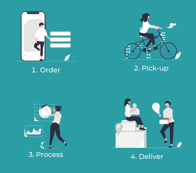
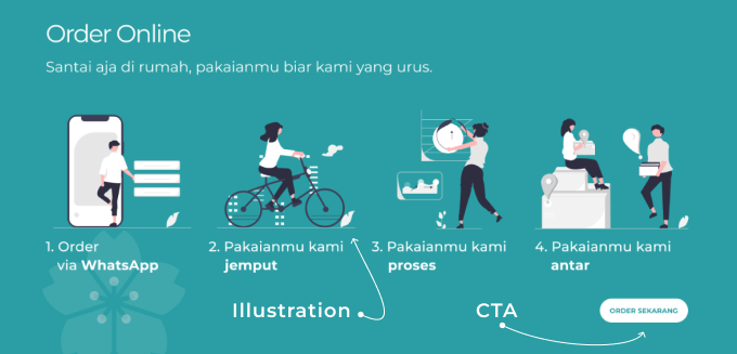
I use the illustration in the Order Online section, this is to give the impression that Ordering Online is a fun thing. And also a button, so the user knows what to do next.
Elegant Typography
I put some content with a background image, to give it a fresh feel.
The Japanese Elements
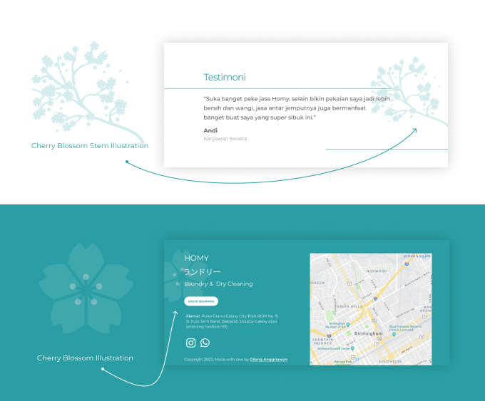
Knowing that clients use the word Japanese in their tagline, perhaps because Japan is one of the cleanest countries in the world, this made me think of adding some elements with a Japanese feel to the design.
Maps
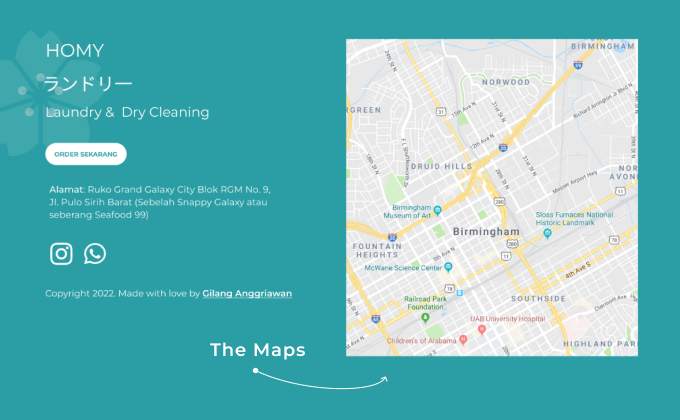
I put Maps in the contact section to make it easier for users to find out HOMY's location.
Result
After the last meeting with the client, this design was completely finished.
