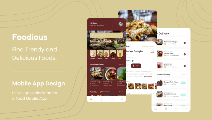
Foodious: Find Trendy and Delicious Foods
Name: Foodious
Year: 2022
Okay, this time I just finished the results of my UI Design exploration, namely Foodious: Find Trendy and Delicious Foods. So, Foodious is a mobile app to find trendy and delicious food for sure.
Goals
After looking at some similar design references on Dribbble, I see a lot of designs that use white as the main color and use a modern style. So, in my exploration this time I decided to use color and style to give it a classic feel, because I was inspired by many restaurants that have classic interior designs.
The User & Audience
The target audience of this app are people who like to eat and mostly women.
Role & Responsibility
UI Designer. As a UI Designer, I collect design ideas, create color palettes, layout layouts, fill content and create final mockups.
Scope
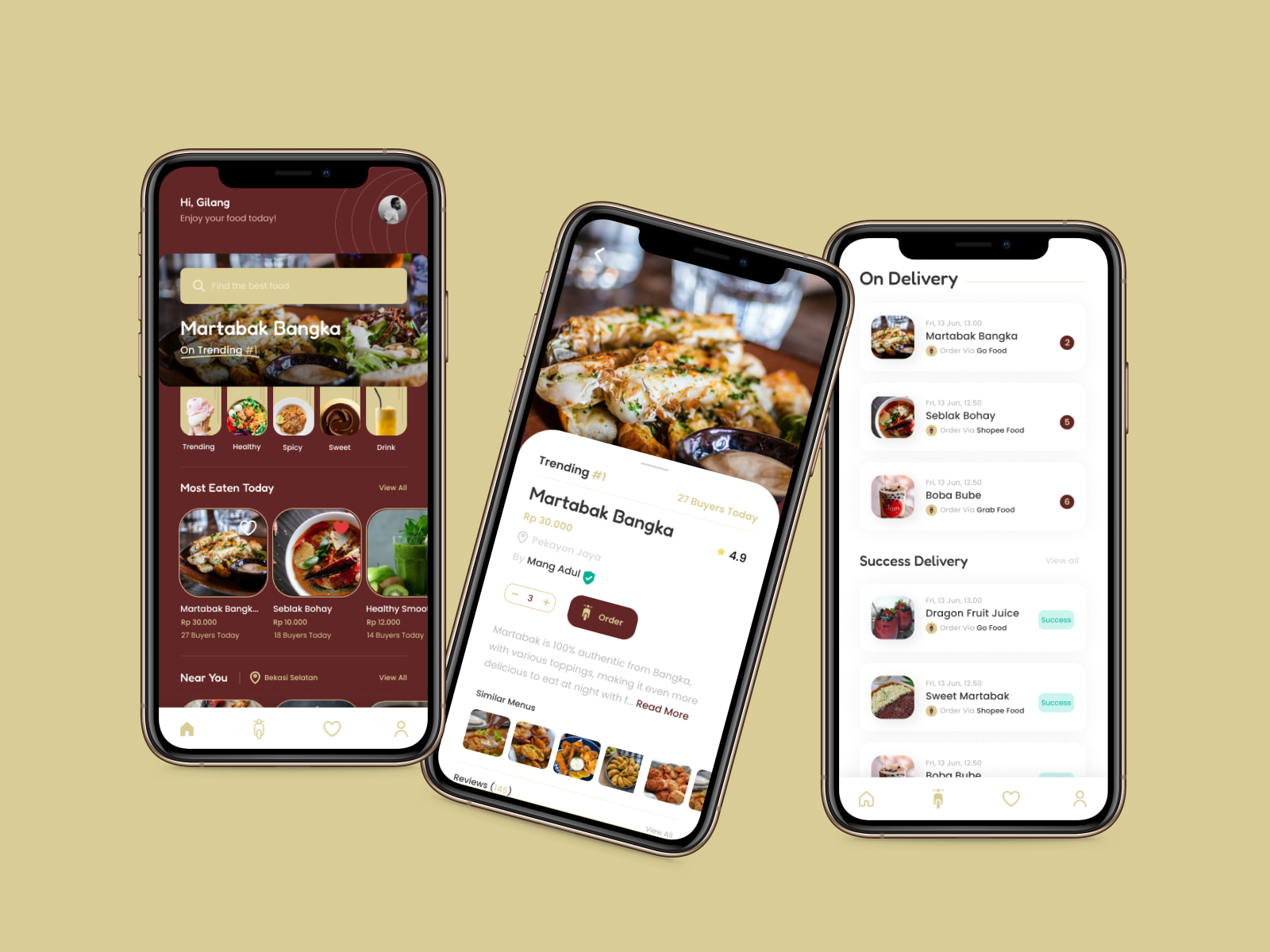
Since this is an exploration, so, I just made some screens. And here's the list of screens:
-
Homepage
-
Detail Product
-
On Delivery
Process
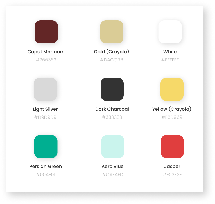
Color Palette
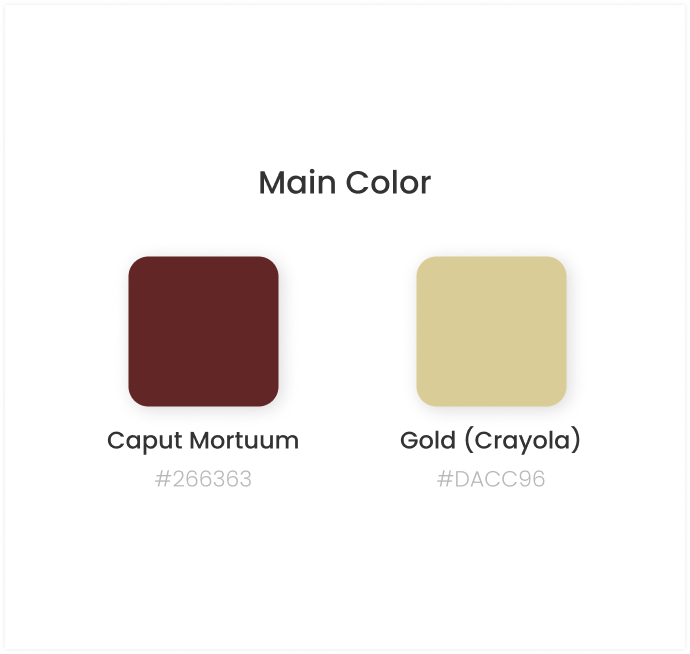
The process of finding this color palette was a little difficult, because I tried to find colors that gave a classic feel but still relevant to Food. After trying several color palettes, I finally found a color that I think is suitable for this design. Oh yeah, I looked for color palettes on the colorhunt.co site. And these is the color palette.
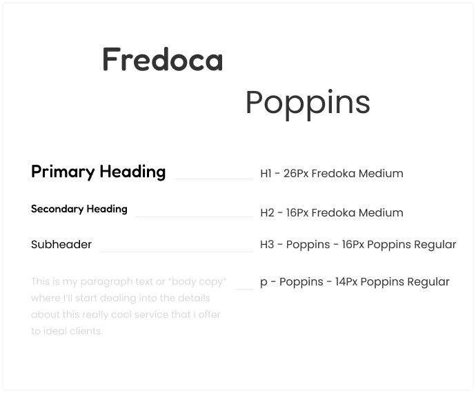
Typography
To give it a classic feel, I used 2 different fonts for typography, Fredoka to give it a classic feel and of course Poppins.
Icons
Icons are very important to make it easier for users to understand the information in the design. I got free icons from the internet, and used a simple style.
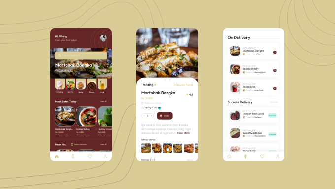
High-Fidelity Design
After getting the required elements, I proceed to the mockup process. As you know, this is a fun process, as we can already 'play around' with the colors, content, layout, and more. And this is the mockup result
Design Decision
Colors
First, I want to explain about color. As I explained above I tried to give a different color from the others and also give this design a classic impression. So, I used Red and Yellow. As far as I know, these two colors are very synonymous with food, but I don't use the natural colors of the two colors, I make this color more muted to give a classic feel.
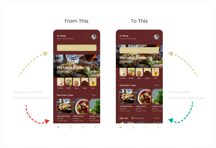
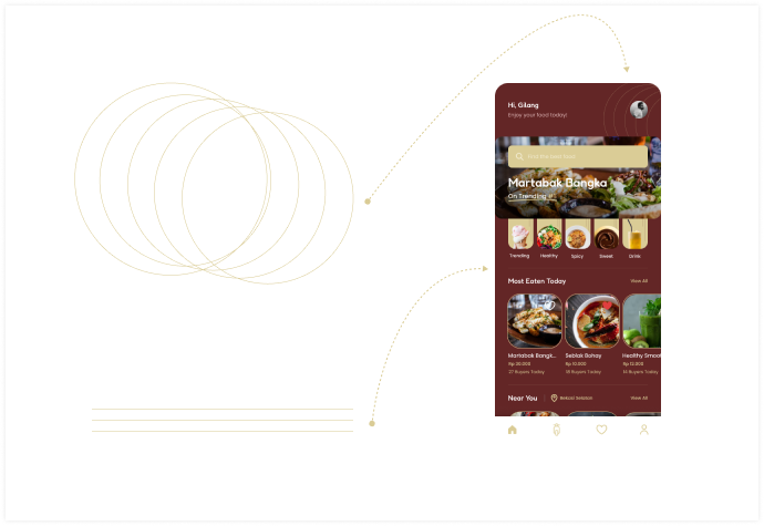
Search Bar & Continuity Principle
Initially I created a separate search bar with Hero Banner, but when I couldn't put 'Near You' Section on the main screen and I was thinking how to make one of these important sections visible on the main screen. So, what I did was place a search bar floating above the Hero Banner, so I don't think this detracts from the convenience of the Search Bar and Hero Banner, and the 'Near You' section can still be on the Home screen.
Elements
To create this design with a classic feel, I only used simple elements in the form of several variations of lines.
Result
After all processes are completed, then this design has been completely completed. And this is the final mockup.