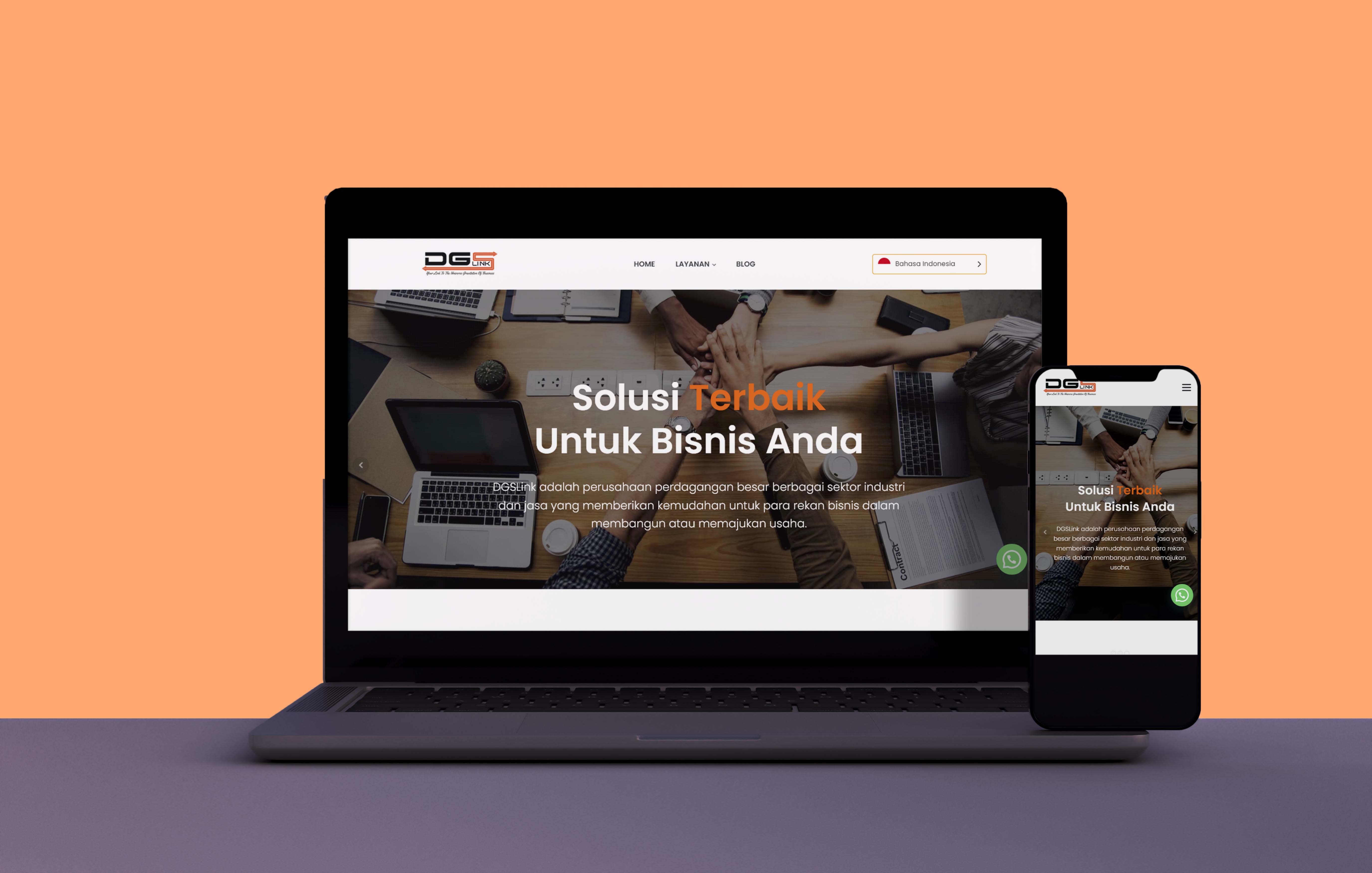
DGSLink Web Design
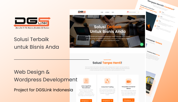
Client: DGSLink
Year: 2022
DGSLink is a big trading company in various industrial and service sectors that makes it easy for business partners to build or advance their business. They provide easy business access in various industrial sectors ranging from plantations, machinery, transportation equipment & spare parts, health, as well as corporate legal services including PT manufacturing services, business licensing services, foreign workers licensing services.

Goals
This is what DGSLink wanted to achieve on their first site.
-
Brand Awareness. They previously didn't have a website, as a company engaged in various industrial sectors, they needed a website that could provide their services.
-
Simple and Professional. They want a simple look but still look professional, because professionalism is needed to be able to work with various companies.

The User & Audience
The target audience is, of course, people who don't know about DGSLink, and how people can find out about DGSLink services. As well as entrepreneurs who want to be closer to DGSLink.
Role & Responsibility
-
UI Designer. I gathered some necessary information to implement into the design, create user flows, wireframes, visual designs, and prototypes.
-
Project Manager. I communicated and discussed with them to work on this project.
-
Wordpress Developer. I also have basic frontend skills, they asked me to develop this website using Wordpress, so it was quite easy for me to improvise on this work.
Scope
This is their first website, so I actually made it from scratch. Starting from the look, feel, and elements on each page. These are the pages.
-
Home
-
Jasa Legalitas Perusahaan
-
Industrial Trading
-
Penyedia Kontainer Bekas
-
Blog
Process
Gathering Requirement
As I explained above, they want a website that is simple but still looks professional. So I tried to ask about the color or website reference they want.

Design Reference
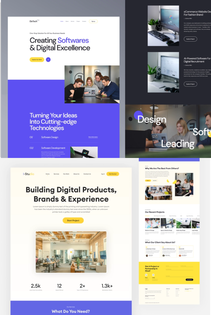
These are some of the reference sites they like.
Sitemap
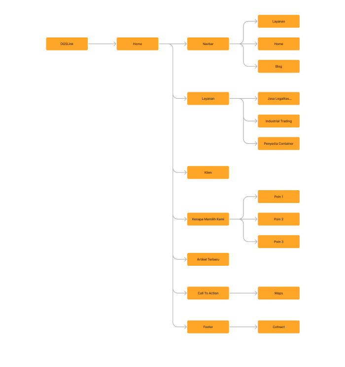
They really want a simple website, this doesn't even need a sitemap. But I still make it, to make it easier for us to understand this website.
Wireframe
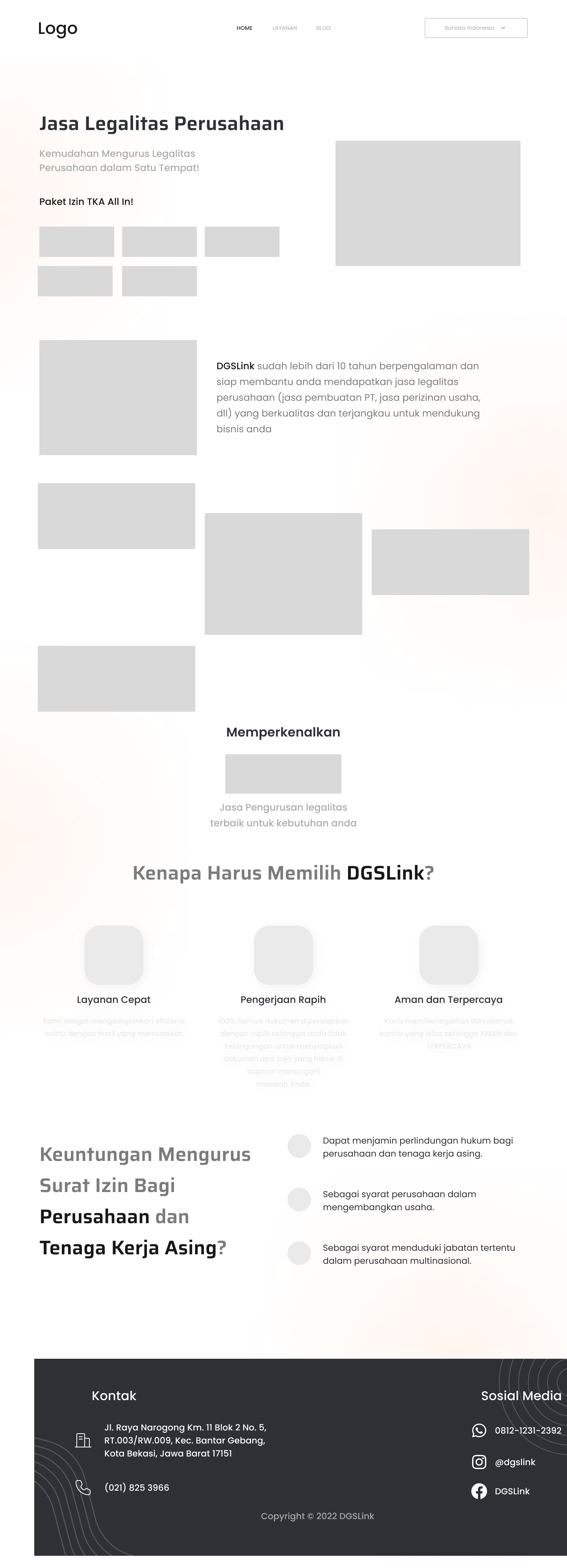
The next process is to create a wireframe. This process is a bit tricky as we don't have any content to display yet, so I'm focused on just creating the layout.


Struggle
First, They don't want their website to have too many elements, it becomes a little difficult to make this website attractive. Second, I fully use icons, elements, even images from free sources on the internet. So it took me a long time to find the right element.
Visual Design
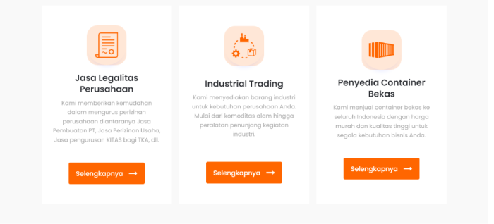
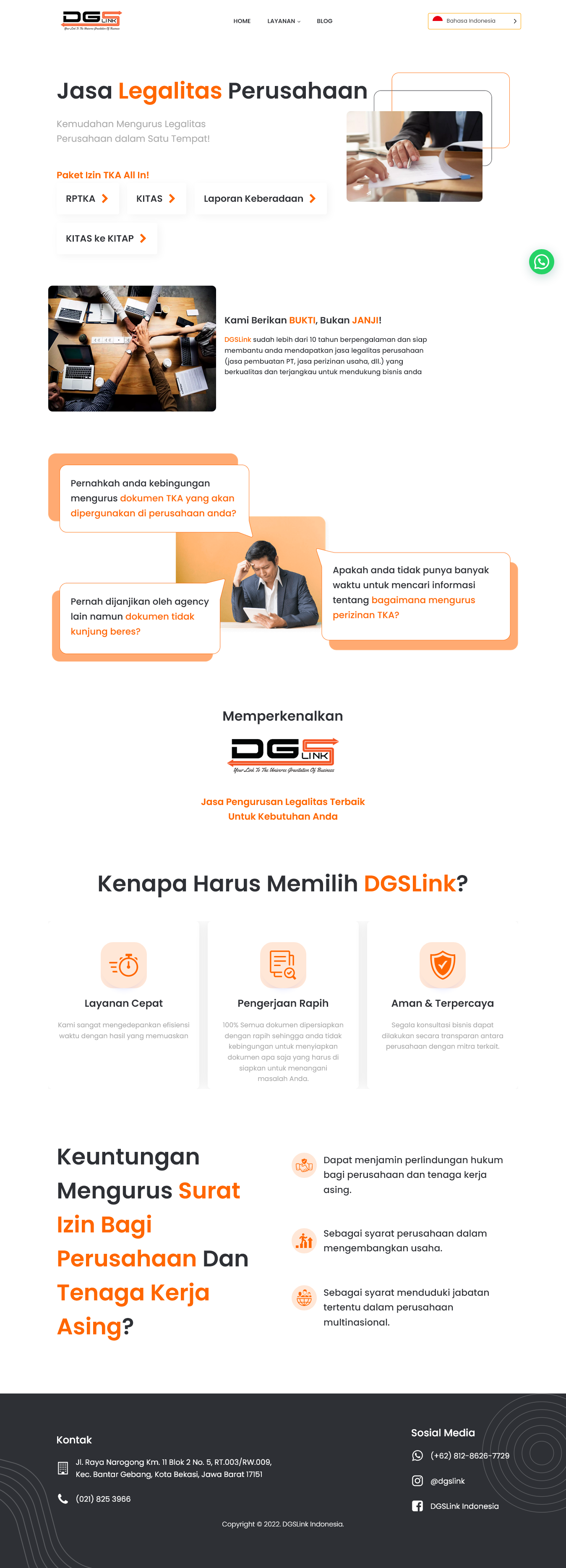
Yeah, this is the most fun process, Visual Design. After getting the Design Elements and Color Palettes, I created a Visual Design. And this is a mockup of the site.

Design Decision
Hero Section
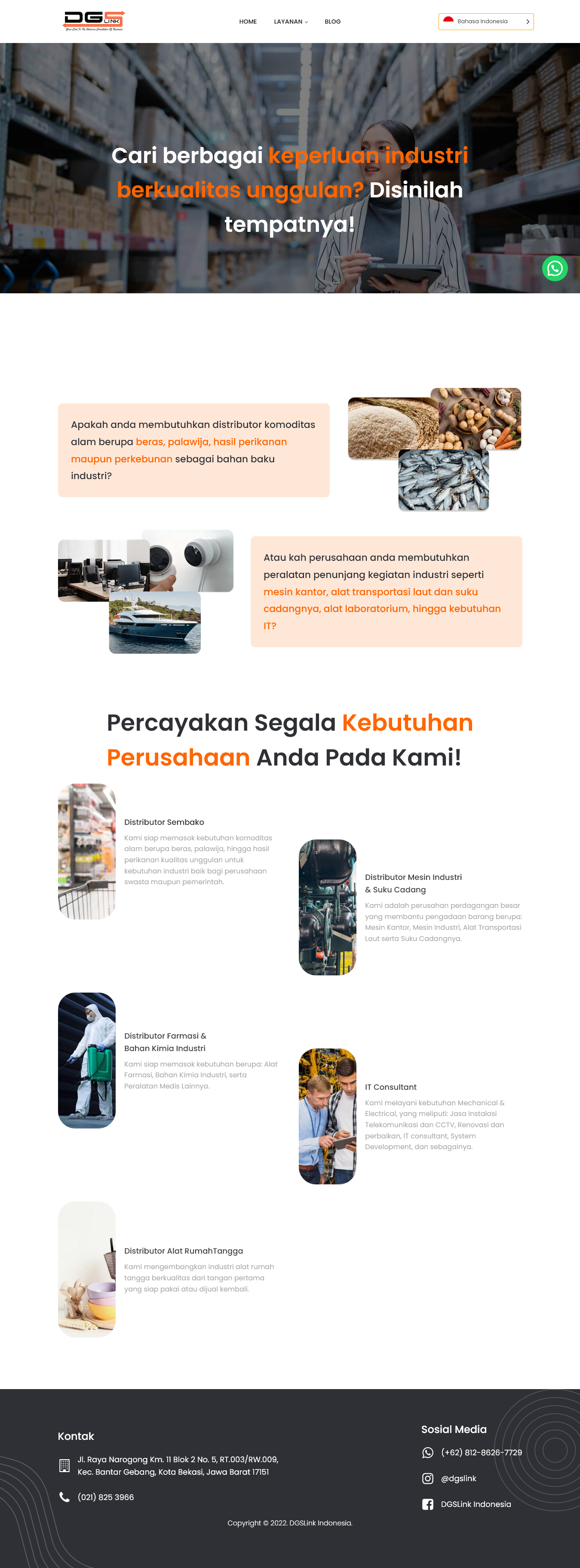
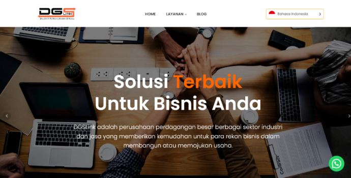
When they want a simple and professional design, then I just create a background using an image that gives a professional feel. There is also a company tagline here.
The Title
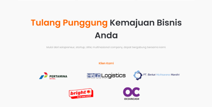
To make this design more eye-catching, I put bold colors on the important words of each heading. Simple, but still interesting.
The Pictures
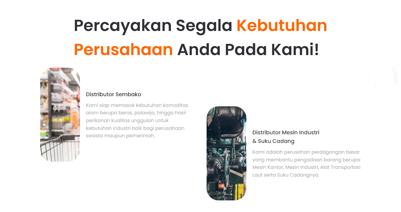
I prefer to use pictures instead of illustrations in this design, because it will make a more serious and professional impression
Design Elements
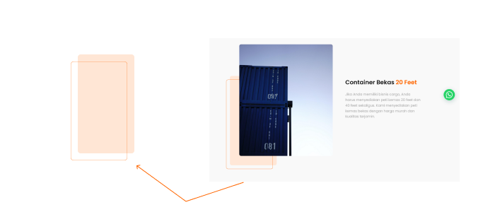
On some pages I create elements to give variety to the design, these are pretty simple elements, just shapes that have light colors, and lines. But this is enough to make this design more interesting.
Result
After everything was done, they felt the design was enough. So next they asked me to develop this design using Wordpress, because before that I also had basic frontend skills, so it was pretty easy for me to improvise on this project. This is a live website.
